
Improving accessibility: An Aircove case study


This post was written by Agata Szczuka, a senior front-end engineer at ExpressVPN, who spearheaded accessibility improvements on the Aircove interface.
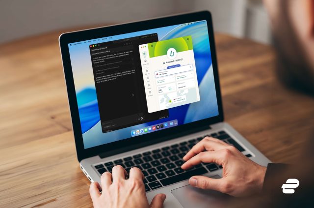
One major reason we set out to make our own routers—Aircove and Aircove Go—was to simplify the VPN router setup process for everyone. By offering routers with ExpressVPN functionality built-in, we’ve been able to reach more people, including those who would find the VPN manual configuration process on a router overly complex.
As users of varying technical ability have begun using Aircove, it’s also driven us to think about inclusivity more broadly. Improving accessibility became a natural next step.
Improving the accessibility of digital products and services ensures equal access to people with disabilities, whether the impairments are visual, auditory, motor, or cognitive. And in fact, providing better accessibility often benefits everyone, with all users getting a better experience.
We wanted to highlight some of the accessibility enhancements we’ve made recently following the guidelines of W3C, an organization that develops standards for internet products.
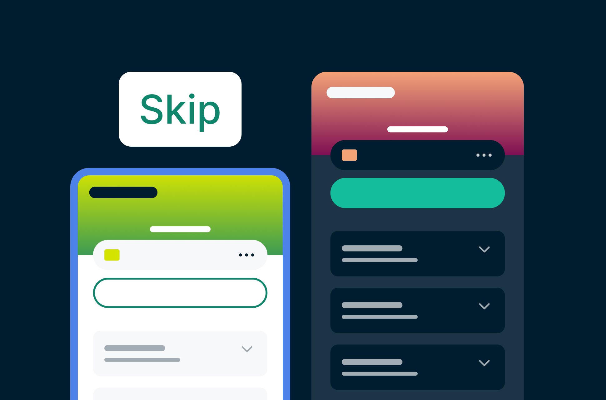
Skip links for faster keyboard navigation
Various disabilities and injuries prevent people from using a cursor (via mouse or touchpad) for navigation. Such individuals often prefer to navigate using only their keyboard. Even people who have no problems using a cursor sometimes choose to use a keyboard to navigate for greater convenience, comfort, and speed.
When a site is not designed with accessibility in mind, pressing keys to move through elements on the screen can be cumbersome. Starting from the top left, the user would often move through a long list of menu items and icons before arriving at their intended element in the main content of the page.
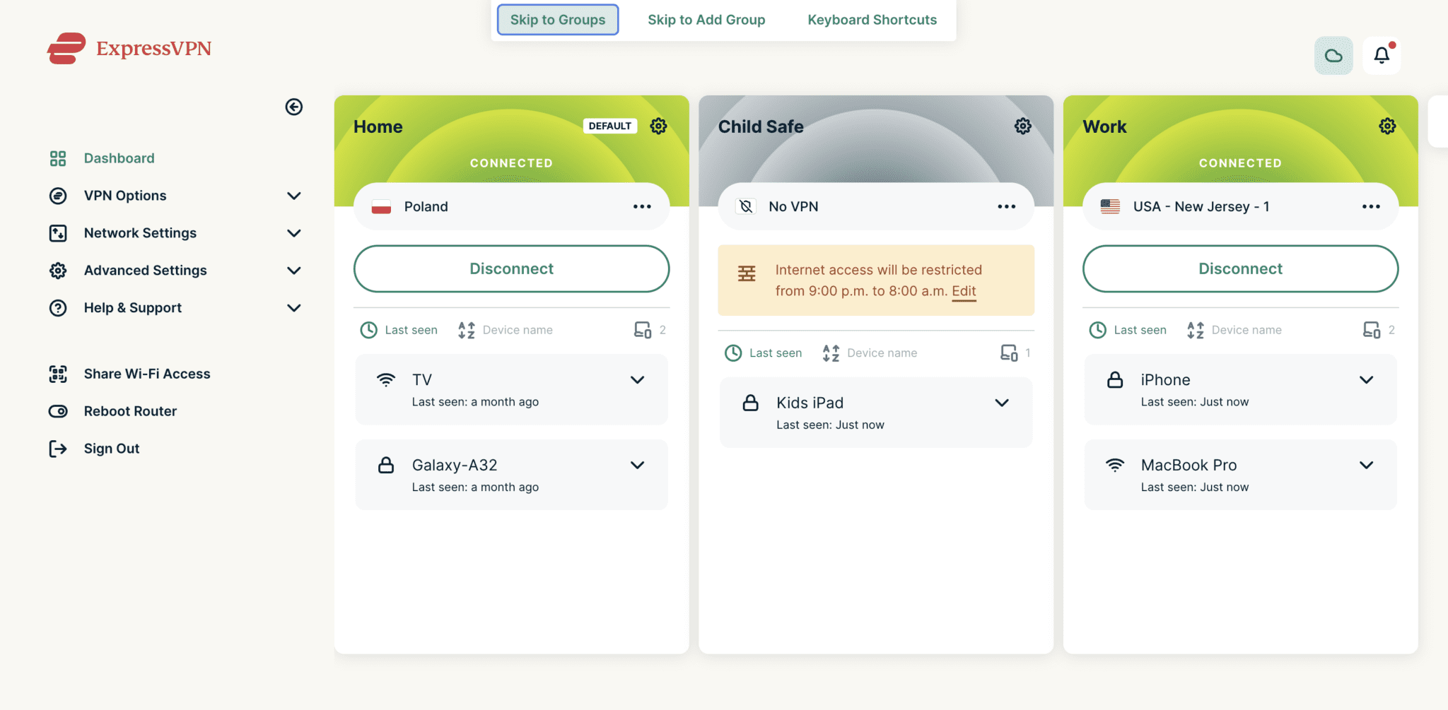
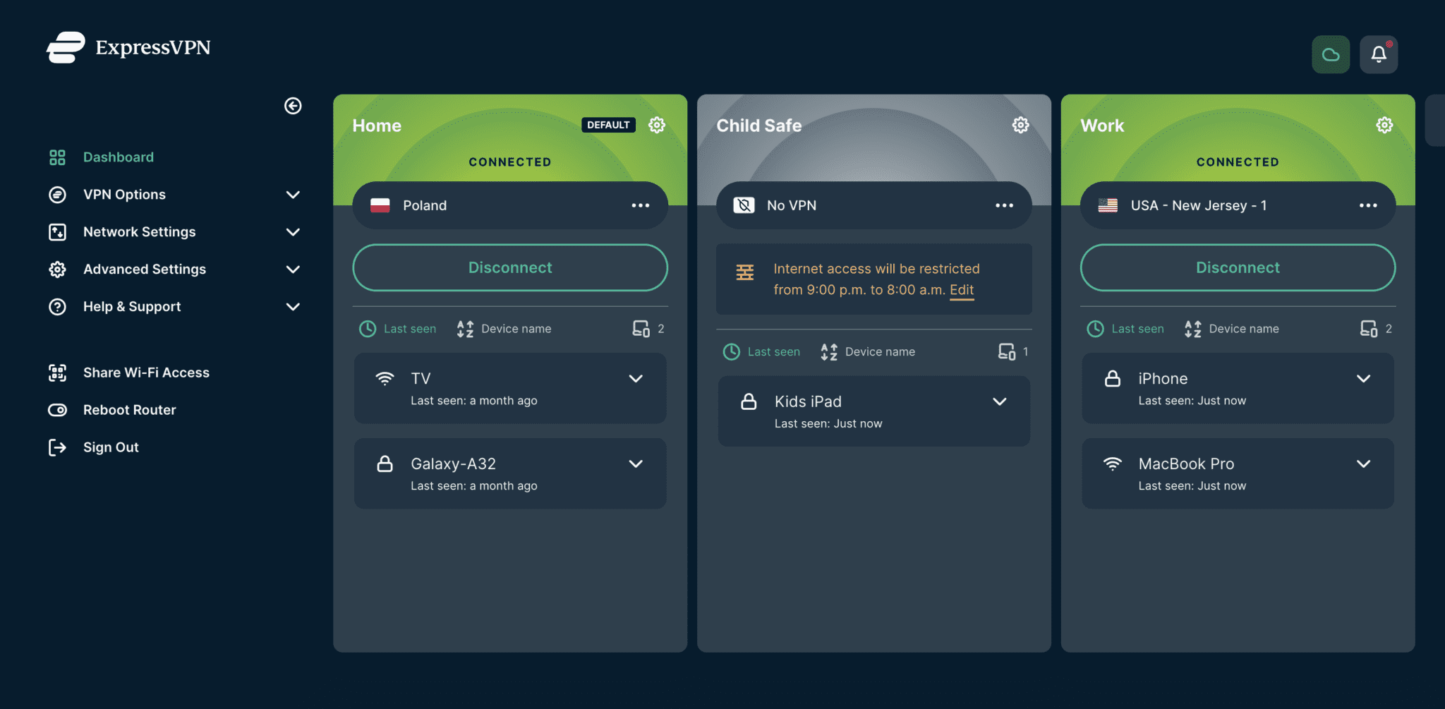
The best practice for accessible keyboard navigation is to offer skip links at the top of the page, allowing the user to skip to certain parts of the page right away. On the Aircove dashboard, skip links can take users directly to the device groups and device lists.
Fixed missing error messages and unclear success feedback
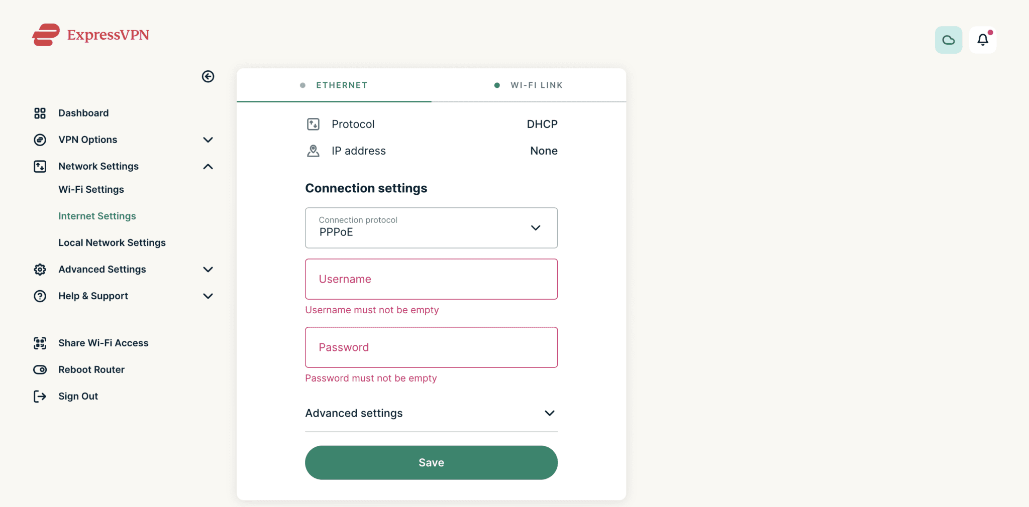
We identified places in the Aircove interface that were missing error messages to make clear what problem a user had encountered. In particular, required fields would turn red when left empty, with no further error messages. Not only was it unclear that this indicated they needed to be filled, but the red color is not easily discerned by a large percentage of people due to colorblindness. Moreover, a user could simply have not noticed the change in color and not been aware that anything was amiss. Adding the error messages solved the problem.
In other instances, we also improved success messages, which tell you when your action was completed or saved successfully, making them more explicit.
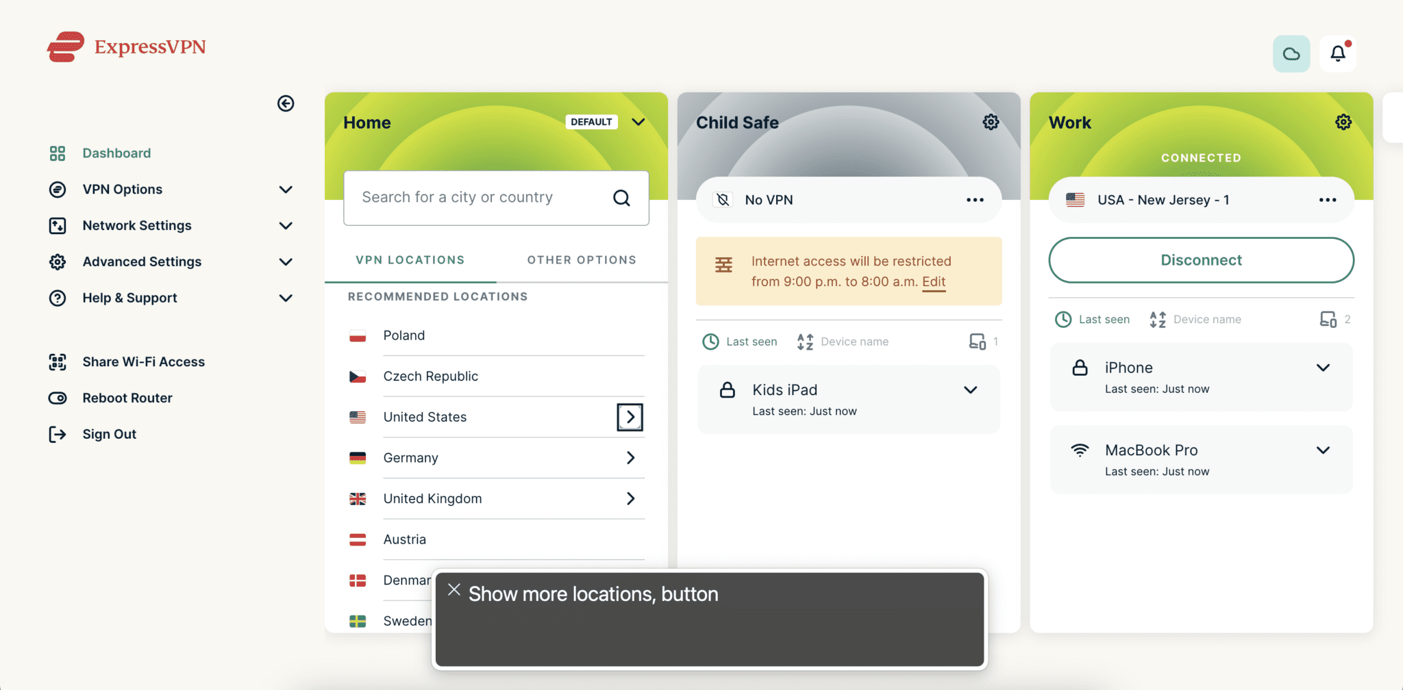
Improved alternative text for icons and symbols
The visually impaired often rely on a screen reader to read aloud the content on a page while displaying subtitles. For instance, when the user navigates to a shopping cart icon, a subtitle text might read “shopping cart button”, while the voiceover announces those words. This text is called alternative text.
Prior to our accessibility improvements, elements within the interface had highly generic labels like “button”. We’ve since made changes to make them more descriptive.
Hiding decorative content when assistive technology is used
For people using screen readers, the voiceover goes through all the elements on the page from top to bottom, including logos and images. But best practices for accessibility are to not make the screen reader read information that’s not useful to the user, such as graphics that are purely decorative.
Explicitly marking an image as decorative will cause assistive technology to skip over the image as if it didn't exist on the page. This reduces the time needed to listen to descriptions of decorative images, which can be long, cryptic file names.
Dark mode
Perhaps most excitingly, we’ve introduced dark mode, which is enabled according to your device’s system preference. Most people would agree that reading something in dark mode is just more comfortable—especially in low light, when a white screen can just feel glaringly bright. Ultimately, offering the choice between dark and light color themes improves usability, while not strictly for greater accessibility.
Accessibility: Always room for improvement
Enhancing accessibility simply makes sense—for us and for our users. If you’re a product designer, we hope this post has inspired you. But we’re just getting started. We’ve heard you want easier ways to move devices between groups, to see more groups on screen at any given time, and to make the mobile experience easier to navigate. So watch this space—there’s always more to come with Aircove.
Take the first step to protect yourself online. Try ExpressVPN risk-free.
Get ExpressVPN


Comments
Where are the promised new firmwares for non-aircove routers ?
Accessibility and ease of use for the setup and monitoring of technical devices is an area that is so overlooked by a vast number of technology companies. With code and user interfaces written and tested by automation, companies are forgetting that humans are not computers and they need to test their product interfaces accordingly, using humans! This a great effort from ExpressVPN and keep up the good work.